

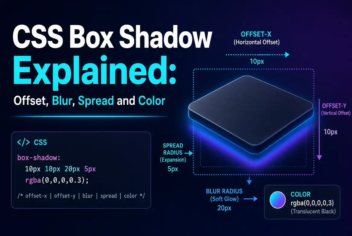
CSS Box Shadow Explained: Offset, Blur, Spread and Color
🚀 Generate perfect CSS box shadows for free with SmartPDFNow! No sign-up, visual editor, instant code.
Shadows add depth, realism, and visual hierarchy to web design. The box-shadow property in CSS is the go-to tool for adding shadows to elements, but its syntax can be confusing at first. What do all those numbers mean? What's the difference between blur and spread? How do you control the color and opacity? In this guide, we'll explain CSS box-shadow in detail, breaking down each component—offset, blur, spread, and color—with practical examples. We'll also introduce a free online CSS shadow generator that makes creating perfect shadows effortless.
Understanding the box-shadow Syntax
The box-shadow property accepts a list of shadows. Each shadow is composed of several values in a specific order. The basic syntax is:
box-shadow: [inset] offset-x offset-y blur-radius spread-radius color;Let's break down each part:
- offset-x (horizontal offset) – How far the shadow is shifted left or right.
- offset-y (vertical offset) – How far the shadow is shifted up or down.
- blur-radius – How blurry or sharp the shadow appears.
- spread-radius – How much the shadow expands or contracts.
- color – The color of the shadow, including alpha transparency.
- inset (optional) – If present, creates an inner shadow instead of an outer shadow.
Offset: Moving the Shadow
The first two values are the horizontal and vertical offsets. They determine the shadow's position relative to the element.
- Positive offset-x moves the shadow to the right.
- Negative offset-x moves it to the left.
- Positive offset-y moves the shadow down.
- Negative offset-y moves it up.
Example: a shadow 10px right and 5px down:
box-shadow: 10px 5px 0 0 rgba(0,0,0,0.3);Blur Radius: Softening the Shadow
The third value is the blur radius. It controls how soft or sharp the shadow's edge appears.
- 0 – No blur; the shadow has a hard edge.
- Larger values – More blur, creating a softer, more diffused shadow.
Example: a soft shadow with 20px blur:
box-shadow: 0 5px 20px 0 rgba(0,0,0,0.3);Spread Radius: Expanding or Contracting the Shadow
The fourth value is the spread radius. It determines the size of the shadow.
- Positive spread – The shadow grows larger than the element.
- Negative spread – The shadow shrinks smaller than the element.
- 0 – The shadow is the same size as the element (before blur).
Example: a shadow that grows outward by 10px:
box-shadow: 0 0 15px 10px rgba(0,0,0,0.3);Color and Opacity
The last value is the color. You can use any CSS color format: named colors, hex, RGB, HSL, or rgba() for transparency. Using rgba() or hsla() with an alpha channel is the most flexible.
box-shadow: 0 5px 15px rgba(0, 0, 0, 0.35);The alpha value (0.35) controls opacity—0 is completely transparent, 1 is fully opaque.
Combining Everything: A Real-World Example
Let's create a typical "card" shadow used in modern UI design. We want a soft, slightly down and right shadow with a subtle spread:
box-shadow: 0 10px 25px rgba(0, 0, 0, 0.12), 0 4px 8px rgba(0, 0, 0, 0.08);This uses two shadows: one larger, softer shadow for depth, and a smaller, tighter shadow for a crisp edge. Layering shadows is a common technique to achieve realistic depth.
Inset Shadows
Adding the keyword inset at the beginning creates an inner shadow, as if the element is pressed inward.
box-shadow: inset 0 2px 5px rgba(0,0,0,0.2);Inset shadows are useful for form fields, buttons in "active" state, or creating embossed effects.
Using the SmartPDFNow CSS Shadow Generator
Writing box-shadow values by hand can be tedious. That's why we recommend the free SmartPDFNow CSS Shadow Generator. It provides a visual editor where you can adjust sliders for offset, blur, spread, and color, and instantly see the result. The generated CSS code is displayed ready to copy into your project. This tool saves time and helps you experiment without guessing values.
How to use it:
- Open the SmartPDFNow CSS Shadow Generator.
- Use the sliders to adjust horizontal offset, vertical offset, blur, spread, and color.
- Preview the shadow live on a sample box.
- Copy the generated
box-shadowCSS code. - Paste it into your stylesheet.
Tips for Professional-Looking Shadows
- Use low opacity. Avoid harsh black shadows; use rgba(0,0,0,0.1) to rgba(0,0,0,0.3) for natural depth.
- Layer multiple shadows. A small, sharp shadow plus a large, soft shadow creates a more realistic effect.
- Match light source. If your design has a light source from top-left, offsets should be positive (shadow bottom-right).
- Keep blur proportional to size. Larger elements can use larger blur; small elements need tighter shadows.
- Use spread sparingly. A little spread can make shadows look more solid; too much looks unnatural.
Frequently Asked Questions
What is the order of values in box-shadow?
The order is: offset-x, offset-y, blur-radius, spread-radius, color. Example: box-shadow: 2px 4px 8px 0 rgba(0,0,0,0.2);
Can I use multiple box-shadows on one element?
Yes. Separate each shadow with a comma. They are applied in order from top to bottom. This is useful for creating layered or directional shadows.
What is the difference between blur and spread?
Blur controls the softness of the shadow edge. Spread controls the size of the shadow—how far it extends outward or inward from the element's box.
How do I create an inner shadow?
Add the keyword inset at the beginning of the shadow declaration, e.g., box-shadow: inset 0 2px 4px rgba(0,0,0,0.3);
Does box-shadow affect layout or page performance?
Box-shadow does not affect layout (it doesn't take up space). However, large shadows can be expensive to render, especially during animation. For performance, avoid animating box-shadow; use opacity or transform instead.
Conclusion: Master CSS Shadows with Confidence
Understanding box-shadow is essential for modern web design. By mastering offset, blur, spread, and color, you can create depth and emphasis that improves user experience. And when you need a quick, visual way to experiment, the SmartPDFNow CSS Shadow Generator is a fantastic free tool. Start creating beautiful shadows today and elevate your design.
Generate Your Perfect CSS Shadow for Free
Use SmartPDFNow's visual tool — no sign-up, instant code, unlimited use.
Try the CSS Shadow Generator Now
Discussion (0)
No comments yet. Be the first to share your thoughts!